Interlude: Room Usage Project
Once again, it’s time to put together what you have learned into a somewhat open-ended project. Presume you are an administrator at a college and need to know how well the classroom buildings are utilized. The github repostiory for this book has a file named roster.csv in the datafiles/chapter06/building_usage directory. The roster file contains data for a list of class sections at a community college. This is real data, except the room numbers have been changed to “anonymize” the data. The file consists of a series of lines like this:
24414;201;ACCTG;022;Payroll Accounting;TTH;06:30 PM;08:20 PM;N190
22719;201;ART;012;Two Dimensional Design;MW;01:45 PM;02:35 PM;P204
22719;201;ART;012;Two Dimensional Design;MW;02:45 PM;04:35 PM;P204
The columns are the registration ID number, the section number, department, course number, course title, days of the week when the course meets, beginning and ending time, and room number. In the field for the days of the week, Thursday is represented as TH, Saturday as S, and Sunday as SU (yes, there are some Sunday classes).1
The ultimate goal of this chapter is to produce a program that will let you visualize the percentage use of each building at a particular time and day of week. (If you like, you can expand this étude to visualize usage on a room-by-room basis, but building usage is more generally useful. This is because not all rooms are interchangeable. For example, a chemistry lab may appear underutilized, but you can’t put a history class in that room when it’s not in use.)
Étude 6-1: Build the Data Structure
You have a lot of options in this étude. Phrasing them in the form of questions:
- Should you include the CSV text as a large string?
- If so, do you include all the columns or just the ones you need for this project?
- If you don’t want to have a large string, you may end up writing a node.js program that takes the data file and creates a ClojureScript source file.
- How will you index the data?
- Day of week → time of day → building
- Time of day → building → day of week
- Building → day of week → time of day
- Some other combination
- Should the data for time of day be an array, map, or some other data structure?
- Should you index days of the week by number or as a map?
- What is the granularity of time of day? Hourly, every 30 minutes, every 15 minutes, or some other unit?
Unless you decide on a single level map or vector, you will want to look at the get-in and assoc-in functions for accessing and modifying data in a nested associative structure.
In order to calculate the percentage of utilization, you will also need to know the number of distinct rooms in each building. Note that the utilization could be more than 100%. For example, there may be classes that are concurrent in different disciplines; an “introduction to computer technology” might be listed under both BIS (Business Information Systems) and CIT (Computer and Information Technology). Or, an open writing lab may be shared by several English classes at the same time.
This is your implementation, so you get to make all these decisions. See what I came up with: Solution 6-1.
Étude 6-2: Visualizing the Data (Version 1)
Now that you have the data in a format that you like, choose a visualization. The one I decided
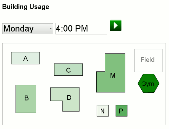
on originally was to use a map of the campus, which is in a file named campus_map.svg in the datafiles folder in the github repository. The file has each building in a <g> element with an appropriate id; for example, the SVG for building B starts like this:
<g>
  <title id="group_B">0%</title>
  <rect
    transform="matrix(0,1,-1,0,0,0)"
    y="-123.85256" x="906.50964" height="74.705124" width="102.70512"
    id="bldg_B"
    style="fill:green;fill-opacity:0;stroke:#000000;stroke-opacity:1" />
The program lets you choose a day and time of day; when either of those field changes, the program calculates the percentage of usage of each building and adjusts the fill-opacity and <title> contents. (I used green for the fill color, because the more the building is in use, the better it is.) Figure 6-1 shows what the resulting page looks like. The “play” button will start advancing time 15 minutes every 1.5 seconds and updating the map automatically.
See a suggested solution: Solution 6-2.
Étude 6-3: Visualizing the Data (Version 2)
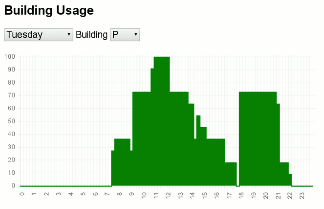
I learned a lot of interesting things while writing the preceding étude, but, to be honest, it didn’t look anywhere near as exciting as I thought it would. A more traditional visualization—a bar chart—gives a lot more information in a very readable form, as you can see in Figure 6-2.
While it would be an interesting exercise to write a bar chart program, it is easier to use an existing library, so I downloaded ChartJS (version 1.0, not the alpha version 2.0 as of this writing) and installed the minimized JavaScript in the public directory. You may use any charting package you wish for your solution. If you feel tremendously ambitious, you may write your own.
See a suggested solution: Solution 6-3.
1You may have noticed that the last two lines in the example have the same registration ID and section number. This is not an error. The first of the entries is the lecture part of the course and the second is the lab part. These are distinguished by an “instructional method” column which has not been included in the sample data.