The comment I received most often in response to my article about Linux and the consumer market was, "Have you looked at KDE (the K Desktop Environment) yet?" No, I hadn't, but I downloaded it and installed it. Herewith my comments, to which I will gladly accept any comments and feedback that you may have. Please note: these are my personal opinions. Your mileage may vary.
A quick summary of my experience:
For the hard-core Linux folks who want to know exactly what I installed, here's the list of the modules (they are all .i386.rpm files):
kdeadmin-1.0-5rh51 kdebase-1.0-7rh51 kdegraphics-1.0-5rh51 kdelibs-1.0-7rh51 kdemultimedia-1.0-7rh51 |
kdenetwork-1.0-5rh51 kdesupport-1.0-7rh51 kdeutils-1.0-5rh51 qt-1.33-1rh51 |

|
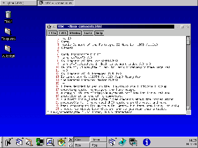
Here is a screenshot of the KDE desktop; you may click the image to see it at full size (800 by 600). |

|
The icons at the left of the screen look like the ones on the latest version of the Macintosh operating system |

|
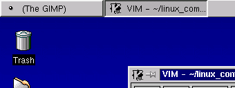
The taskbar is similar to the one in Windows 95, but it is at the top of the screen rather than the bottom. The Windows users feel comfortable with the taskbar; Macintosh users look to the top of the screen for the "applications in use" menu. |

|
|
The control strip, called the panel in KDE,
combines the desktop manager and an
application launcher. It looks like the Macintosh version and occupies
the same area of the screen. The icons are smaller than those
in the AfterStep wharf. If you click on the bar at the left, the
entire panel folds away to a very unobtrusive area,
unlike the AfterStep wharf, which folded down to a 64 x 64 icon.
The icons which have small up-arrows on them produce menus when you click them, thus giving the Windows user the good feeling of the "start" menu. See a picture of the panel with menus and submenus |
More about the Desktop
KDE Applications
Back to Linux article feedback